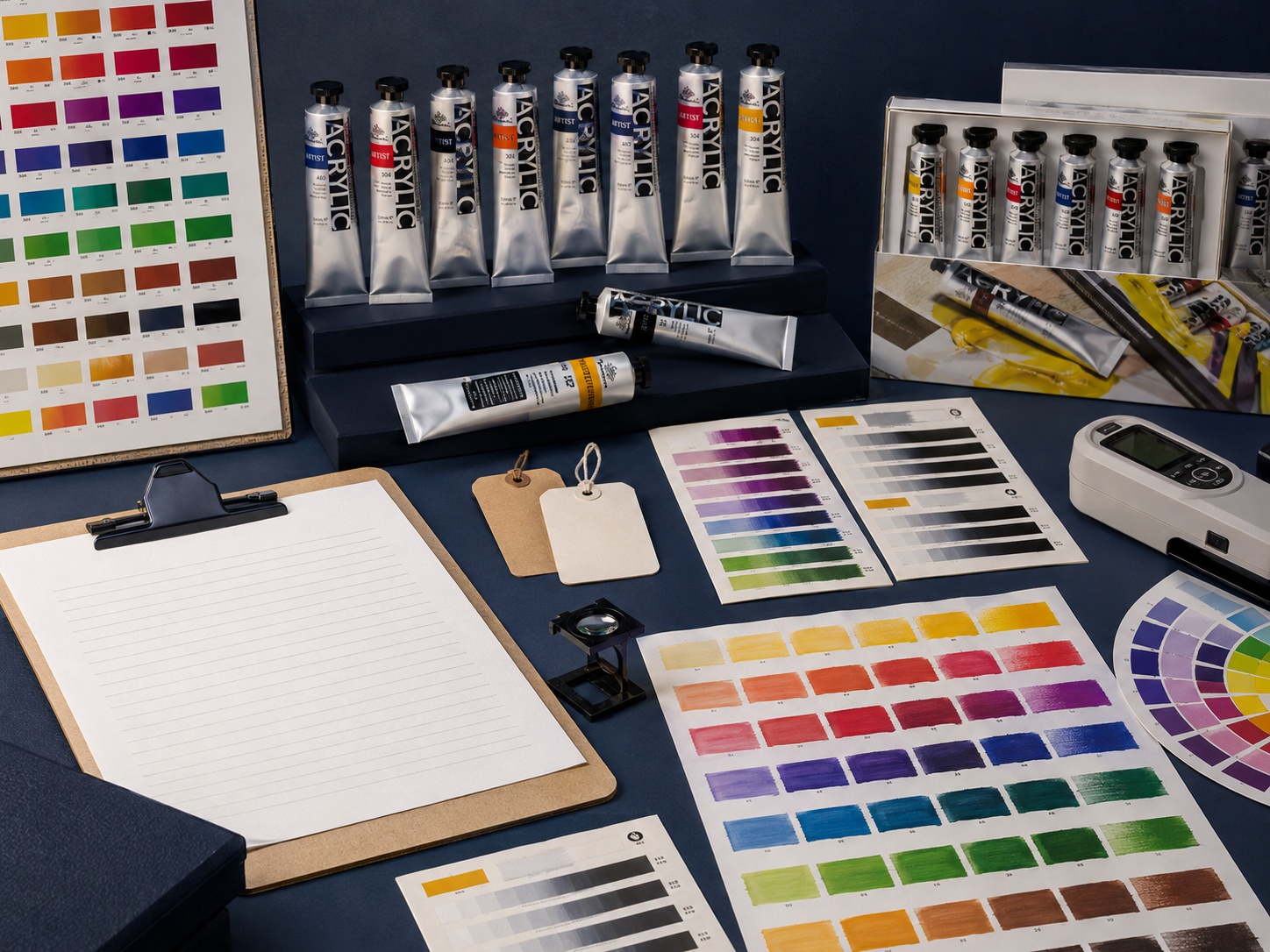
An effective wholesale acrylic paint programme for portrait use should do more than place several beige and brown tubes in a box. Its skin-tone range should give the intended user a workable path across value, undertone, temperature and chroma, while giving the buyer clear colour data, repeatable samples, appropriate packaging and a replenishment plan.
For most art-supply businesses, the first decision is not “Which flesh colour should we add?” It is which range architecture best fits the channel:
- a compact preselected set for guided use and an accessible first purchase;
- a broader colour range for artists who want to mix across more subjects and undertones;
- an open-stock or hybrid programme that allows popular colours to be replenished individually.
The right answer depends on the customer, price architecture, teaching model, shelf space and after-sale expectations. A six-colour set and a 36-colour range should therefore be treated as different merchandising tools, not as smaller and larger versions of the same promise.
Start with the user task, not a universal “flesh” colour
Skin is not one fixed hue. Within a portrait, visible colour changes with value, lighting, surrounding colour, undertone and reflected light. Across subjects, a useful palette may need to move through warm, cool, light, middle and deep mixtures without suggesting that one premixed colour represents everyone.
For a buyer, this creates two responsibilities:
- Build functional colour relationships. Each colour should have a clear role in mixing, adjusting or extending the range.
- Describe the range accurately. Product names, swatches and teaching materials should support observation and mixing rather than promote a single “correct” skin colour.
This is both a product decision and a communication decision. Inclusive presentation is not achieved simply by adding more brown swatches. The range must show how colours combine across different values and undertones, and the packaging must make those relationships understandable.
Compare three acrylic range architectures
The central choice is between convenience, breadth and replenishment. A compact set lowers the entry barrier; a broader set increases mixing flexibility; open-stock support improves repeat purchasing and long-term range value.
| Range architecture | Best suited to | Commercial strength | Main limitation | Support material required |
|---|---|---|---|---|
| Compact six-colour skin-tone set | Gift, beginner, workshop and guided-project channels | Clear use case, smaller shelf footprint and an easy first decision | Can appear restrictive if it implies that six premixed colours cover every subject | Mixing chart, value steps, undertone examples and clear limitation statement |
| Broader 36-colour acrylic set | General art retail, ecommerce, academies and developing artists | Extends beyond portraiture and gives more warm, cool and chromatic options | More complex to explain; some colours may receive little use without guidance | Colour-role guide, portrait exercise, set contents and suggested core palette |
| Open-stock or hybrid programme | Specialist retail, repeat users, schools and private-label ranges | Supports replenishment, replacement and local assortment building | Requires stronger SKU, barcode, inventory and colour-data control | Master colour chart, individual SKU data, reorder list and approved label system |
The six-colour and 36-colour formats can coexist if their roles are explicit. A compact set can be the guided entry product, while the broader range or open-stock selection becomes the expansion and replenishment path. The merchandising problem begins when both products use the same promise and the customer cannot tell why the larger range is worth the extra shelf space or price.
Phoenix currently presents acrylic paints, colour sets, mediums, tools and surfaces as one B2B category system. Buyers can review the Phoenix acrylic painting supplies range before deciding whether a skin-tone theme should be a standalone set, an educational subset of a larger line or part of a private-label assortment. Exact colour lists, pack sizes and market availability should be confirmed against the current quotation and approved sample.
Give every colour a functional role
A themed set becomes easier to evaluate when the buyer asks what each colour does rather than whether its printed name sounds familiar. A practical skin-tone system normally needs roles such as the following:
| Colour role | What it contributes | Buyer question |
|---|---|---|
| Light-value control | Raises value and creates tints or highlights | Which white is supplied, how strong is its tinting effect, and how quickly can it overpower mixtures? |
| Warm yellow or ochre | Supports golden undertones and warm transitions | Is the colour transparent, semi-opaque or opaque in the proposed formula and application thickness? |
| Warm red or earth red | Adds red warmth and helps move mixtures away from flat yellow-brown | Is it a single-pigment colour or a mixture, and how does it behave with white? |
| Warm earth dark | Establishes middle and deeper warm values | Does it remain chromatically useful in tints, or become dull too quickly? |
| Cool adjusting colour | Reduces excessive orange chroma and introduces cooler shadow shifts | How strong is it, and can a beginner control it in small additions? |
| Optional chromatic extensions | Adds violet, green, blue, yellow or red options for varied lighting and undertones | Are these colours essential to the core set or better positioned in the broader range? |
These are functional categories, not a fixed recipe. The actual pigments and formulas determine tinting strength, undertone, opacity and mixing behaviour. Two paints with the same colour name can use different pigments, and two paints with the same pigment code can still differ because of pigment concentration, dispersion, binder, additives and manufacturing choices.
That is why a buyer should approve a colour-role map and physical samples together. A spreadsheet of names is not enough, and an attractive screen swatch is not a substitute for dried paint films.
Decide what each channel needs from the range
Art retail: make comparison and expansion easy
Retail customers need to understand what the set is for, what is included and where they go next. A compact skin-tone set should therefore show more than six tube images. The pack or product page should explain the role of the colours, show several mixed values and undertones, and state whether individual replacement colours are available.
For specialist art stores, a hybrid structure is often easier to merchandise:
- one clearly themed introductory set;
- a broader artist acrylic range nearby;
- a simple cross-reference showing which open-stock colours extend the set;
- a portrait exercise or artist demonstration that makes the range visible in use.
The aim is not to force every customer into a larger set. It is to give the customer a credible expansion route after the first project.
This themed-set decision should also fit the wider category architecture. For the surrounding canvas, brush, medium and tool logic, see how to build a complete painting-supplies range for an art brand.
Education: teach relationships, not memorised formulas
Schools, academies and workshops need predictable class planning. A teaching set should make it possible to explain value, warm/cool shifts, complementary neutralisation and controlled use of white. Teachers may also need consistent pack contents, replacement stock, class quantities and worksheets that use the same names and symbols as the physical labels.
Before approving an education programme, ask:
- Can students create a useful light-to-deep value sequence?
- Are both warm and cool adjustments possible?
- Are the most powerful colours identified so students know to add them gradually?
- Do the colour chart, tube label, worksheet and online description use the same names?
- Can the school reorder the most-used colours without replacing every set?
Private label: define the product before designing the box
For a private-label acrylic paint programme, the commercial brief should be agreed before packaging artwork begins. The brief should state the target user, price tier, required colour roles, tube size, set count, open-stock policy, languages, barcode ownership, warning fields, carton quantity and approval process.
Do not start with “six attractive skin colours”. Start with a controlled question:
What must this assortment allow the target customer to mix, how will that outcome be demonstrated, and what evidence must remain consistent from formula to label and reorder?
Packaging can then communicate an approved product instead of becoming the document that accidentally defines it.
Verify the technical data behind the colour names
Professional range planning requires more than visual selection. ASTM D5098-16(2021), the active Standard Specification for Artists’ Acrylic Dispersion Paints, identifies composition, physical properties, performance and labelling as part of a common basis for producers, distributors and users. Its scope includes pigment identification, lightfastness, bleeding, consistency and drying time.
That does not mean every proposed Phoenix SKU should be described as compliant without product-specific evidence. It means the buyer has a recognised framework for asking better questions.
Pigment identification
Record the Colour Index pigment code or codes for each approved colour where the information is provided. A familiar commercial name is not a formula. If a colour is a multi-pigment mixture or a hue, the label and technical record should not imply that it uses a different historical or single pigment.
Opacity and transparency
Opacity is relevant to block-ins, corrections, layered portrait painting and educational expectations, but it must be evaluated under controlled conditions. GOLDEN’s technical specification guide notes that opacity/transparency ratings are commonly made by comparing similarly prepared samples and that a colour can appear opaque in a thick application yet transparent when spread thinly or extended with medium.
For buyer approval, specify the test method: substrate, drawdown thickness or applicator, number of coats, drying time and comparison background. Do not approve an opacity symbol from a single brush mark of unknown thickness.
Lightfastness
Lightfastness describes resistance to colour change under light exposure within a stated test and rating system. It is not interchangeable with the broader term permanence. Record the rating system, test basis and any colours for which the rating is unavailable or provisional.
The supplier’s symbol legend, colour chart, label and technical sheet must agree. Do not copy a rating convention from another brand without confirming the underlying method.
Tinting strength, undertone and dried appearance
Tinting strength affects how easily a colour controls a mixture. This is especially important when a small amount of blue-green or a strong white is used to adjust a warm skin-tone mixture. Compare colours with a documented ratio and the same white, application method and drying interval.
Acrylic colour can also look different after water leaves the film. Buyers should therefore approve dried masstone, thin application and tint samples—not only wet paint or printed packaging swatches.
Batch and document consistency
The approved sample, production batch, label, colour chart and order record should point to the same product version. A robust approval pack can include:
- formula or controlled product reference;
- colour name and pigment code or codes;
- opacity/transparency classification and legend;
- lightfastness information and rating basis;
- wet and dried colour standards;
- tube, cap, seal and fill-weight requirements;
- label artwork and language version;
- applicable safety and compliance documents;
- outer carton, barcode and case-quantity information;
- retained approval sample and change-control record.
Any AP, ASTM D4236, EN71 or other safety/compliance statement should be tied to the product and market for which the document applies. A certificate displayed elsewhere in a catalogue should not automatically be extended to every colour or set.
Use a staged sample-approval process
The fastest way to create avoidable disagreement is to approve colour by email description alone. A staged process separates range logic from physical performance and packaging control.
| Approval stage | What the buyer reviews | Suggested record |
|---|---|---|
| 1. Range brief | Target channel, user, price tier, colour roles, set count and replenishment model | Approved product brief |
| 2. Data review | Names, pigment codes, opacity, lightfastness basis, labelling and applicable documents | Technical comparison sheet |
| 3. Paint sample | Masstone, thin film, tints, warm/cool mixtures, handling and dried appearance | Signed sample board and test notes |
| 4. Set trial | Whether the proposed selection completes realistic portrait and teaching tasks | Controlled exercise with recorded materials |
| 5. Packaging mock-up | Tube identification, colour order, insert, languages, barcode and warnings | Approved artwork proof |
| 6. Pre-production sample | Final paint, fill, seal, pack and carton against the approved master | Pre-production sign-off |
| 7. Production control | Batch checks and traceability against the retained standard | Inspection and release record |
The test panel should include more than attractive standalone swatches. A useful approval board can show:
- masstone over a light and dark reference field;
- thin-film undertone;
- a repeatable tint step with the same white;
- warm-to-cool neutralisation;
- a light, middle and deep value sequence;
- one or more practical portrait mixtures;
- dried samples labelled with batch and date.
The goal is not to make a laboratory test look like a painting demonstration. It is to ensure that the buyer, supplier and internal quality team are evaluating the same product against the same decision criteria.
Treat artist demonstrations as product education, not complete technical proof
An artist demonstration can show whether a colour selection supports a real workflow. It can reveal which colours the artist reaches for, how the range moves from warm to cool, whether the set supports varied values and where users may need additional guidance.
Phoenix’s C-site tutorial shows how artist Laresian uses a 36-colour retail acrylic set to build light, medium and deep skin tones through a five-step painting process. After the C-site draft is published, B-site readers can view the acrylic portrait and skin-tone demonstration as an artist-use example.
The demonstration is useful evidence for workflow and product education. It does not, by itself, establish:
- exact pigment identity for every colour;
- standardised opacity or tinting-strength rankings;
- lightfastness or permanence;
- batch-to-batch consistency;
- superiority over a competing range;
- suitability for every retail, education or private-label programme.
For commercial approval, combine artist-use content with controlled sample boards, current product data, applicable documents and the buyer’s own acceptance criteria. Keep the B-site CTA focused on samples, technical review and quotation; creator discount codes belong on the consumer journey, not in a procurement guide.
Plan packaging and replenishment with the colour system
The value of a colour set can be lost if packaging and replenishment are decided too late. Before confirming the programme, review:
Set and tube format
- colour count and tube size;
- colour order in the box;
- whether the most-used colours need larger volume or replacement access;
- cap, seal and leakage expectations;
- retail dimensions, weight and shelf presentation.
Labelling and information hierarchy
- brand and range name;
- colour name and product reference;
- pigment code or codes where declared;
- opacity and lightfastness symbols with a clear legend;
- net contents and responsible-party information;
- market-specific warnings and languages;
- barcode and lot/batch traceability.
Retail and teaching support
- printed or digital colour chart;
- photographed dried swatches rather than screen colour alone;
- mixing guide organised by value and temperature;
- QR or URL path to a tutorial;
- teacher or workshop worksheet where applicable;
- reorder guide linking set colours to individual SKUs.
Commercial control
- MOQ by set, colour and packaging format;
- sample and artwork charges where applicable;
- case quantity and master-carton requirements;
- lead-time assumptions and approval gates;
- ownership of artwork, barcodes and translated copy;
- rules for formula, pigment, label or packaging changes.
These commercial fields must be confirmed for the actual project. They should not be inferred from a consumer product page or a previous buyer’s programme.
A buyer checklist for the first supplier discussion
Use the following questions to turn an initial idea into an actionable range brief:
- Who is the primary user: beginner, developing artist, school, academy, specialist retailer or general ecommerce customer?
- Is the product a compact theme set, a subset of a broader range or an open-stock programme?
- What light, middle, deep, warm, cool and neutralising roles must the selection cover?
- Which names and pigment codes belong to the proposed colours?
- How are opacity and lightfastness communicated, and what test or rating basis supports the symbols?
- What physical sample board will be used for approval?
- How will production batches be compared with the approved standard?
- Can high-use colours be replenished individually?
- Which tube sizes, packaging formats, languages and barcodes are required?
- Which safety or compliance documents apply to the specific products and destination markets?
- What artist demonstration, mixing chart or teaching material will support the launch?
- What are the quotation, sampling, artwork, MOQ and production-approval steps?
Build the range around a verifiable promise
The strongest acrylic skin-tone programme is not necessarily the one with the most colours. It is the one whose selection, data, samples, packaging and education all support the same user promise.
A compact set can make the first purchase easier. A broader range can support more varied undertones, lighting and subjects. Open-stock support can improve replenishment and repeat value. The commercial opportunity comes from choosing the right structure for the channel and proving that the physical product matches the approved range logic.
Explore Phoenix acrylic painting supplies, review the current Phoenix catalogue, or contact Phoenix Art Materials to discuss colour roles, samples, technical information, packaging and an acrylic programme for retail, education or private label. Exact formulas, colour counts, pack formats, MOQ, lead time and document scope must be confirmed for each project.
Frequently asked questions
Is a six-colour skin-tone acrylic set enough for retail?
It can be enough for a clearly defined beginner, gift or guided-project offer if the colours support useful value and temperature relationships. It should not be presented as a complete representation of every skin tone. A mixing guide and a visible expansion path make the set more credible.
When is a 36-colour acrylic set a better choice?
A broader set is more suitable when the customer wants to paint subjects beyond portraiture, explore more chromatic shifts or choose among several warm and cool options. Its value must be explained through colour roles and exercises; colour count alone is not a sufficient merchandising argument.
Should a skin-tone set use premixed colours or primary and earth colours?
Either structure can work. Premixed colours improve convenience, while a mixing-led selection can teach more adaptable colour relationships. The decision should follow the user, channel and teaching promise, then be verified with physical mixture tests.
What technical information should a buyer request for acrylic colours?
Request colour names, product references, pigment codes where declared, opacity/transparency information, lightfastness data and rating basis, relevant safety/compliance documents, packaging specifications and version-controlled sample records. Confirm that labels, charts and technical documents agree.
Can an artist video replace supplier sample testing?
No. A video can demonstrate workflow, colour selection and educational value, but it cannot replace controlled evaluation of pigment data, dried films, opacity, lightfastness, batch consistency, packaging and the buyer’s acceptance criteria.
What should be approved before private-label packaging is printed?
Approve the product brief, colour selection, technical data, physical paint samples, tube and pack specifications, label fields, language versions, barcodes, applicable warnings and a pre-production sample. Record who approves changes and how revised versions will be identified.