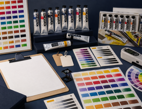
Oil colour name tells you where a paint sits in a palette; a pigment code tells you more about what creates that colour. The two are related, but they are not interchangeable. “Permanent Green”, for example, can be a mixture rather than one universal pigment, while two paints with the same familiar name may use different formulas.
For artists and buyers, the practical rule is simple: compare colour name, pigment code or codes, opacity, rating legend and product reference together. Never treat the printed name or an on-screen swatch as a complete specification.
What does a pigment code mean?
Artists’ colour labels often use Colour Index Generic Names. A code normally combines:
Pfor pigment;- a hue-family letter, such as
Bfor blue,Yfor yellow orWfor white; and - a number identifying that registered colourant within the family.
Examples commonly seen across artists’ materials include PB29, PY42 and PW6. These codes identify colourants; they do not by themselves state pigment concentration, grade, milling quality, binder, handling, safety, permanence or final paint performance.
The Colour Index system is useful because brand names and historical names vary. A pigment code gives artists, teachers and product teams a more stable comparison point.
Why can the same colour name contain different pigments?
Colour names have several origins:
- Pigment-linked names refer to a recognised pigment tradition.
- Historical names may survive even when the original material is no longer used.
- Brand or convenience names describe a useful appearance or mixture.
- Hue names indicate an alternative pigment or mixture intended to approximate another colour.
None of these categories automatically means “better” or “worse”. The important question is whether the name, pigment information and intended behaviour are communicated clearly.
Winsor & Newton’s current Artists’ Oil Colour table, for example, lists colour name, opacity, permanence, lightfastness code, pigment codes, series and vehicle oil as separate fields. Its Permanent Green entry is identified as a multi-pigment formula. This illustrates why the product name alone cannot reveal the formulation. See the official Artists’ Oil Colour data table.
How to read an oil-paint label in the right order
The fastest useful label check is not “Do I recognise the name?” Use this sequence instead.
| Label field | What it answers | What it does not prove |
|---|---|---|
| Colour name | Where does the colour fit in the range? | A universal formula |
| Product/SKU code | Which exact item should be reordered? | The pigment identity |
| Pigment code(s) | Which colourant or mixture is declared? | Pigment concentration or quality |
Hue wording |
Is the named appearance produced with an alternative formula? | Inferior performance |
| Opacity symbol | Is the paint positioned as transparent, semi-transparent, semi-opaque or opaque under that brand’s system? | Identical coverage at every film thickness |
| Lightfastness/permanence mark | How is durability classified under the stated legend? | The meaning of another brand’s symbol |
| Series/price group | Where does the colour sit in that range’s price structure? | A universal quality grade |
| Safety text | What handling or warning information applies? | A substitute for the current SDS |
The buyer implication is important: a colour chart, tube label, e-commerce page and order sheet should use the same product code and formulation information. Small inconsistencies create wrong replacements, artwork revisions and avoidable customer-service work.
What does “hue” mean on artists’ paint?
On a well-documented label, hue generally means that another pigment or combination is used to achieve a similar colour appearance to the named reference. Reasons can include cost, availability, handling, permanence or safety.
A hue is not automatically a low-grade colour. It may be the better choice for a particular user or price position. What matters is transparent disclosure and performance appropriate to the range.
When comparing a genuine colour with a hue, check:
- pigment code or codes;
- masstone and undertone;
- tinting strength;
- opacity;
- mixing behaviour;
- stated durability system;
- applicable warning information; and
- price and replenishment needs.
Single-pigment and mixed colours need different questions
A single-pigment colour uses one declared colourant. A multi-pigment colour uses two or more. Single-pigment colours can simplify mixing decisions, but they are not automatically superior. A carefully designed mixture can provide a useful convenience colour, stable neutral or familiar palette function.
The better question is: does this formulation perform the job for which the colour is sold?
Read the companion guide, Single-Pigment vs Multi-Pigment Oil Colours, before deciding how each type should be represented in a range.
Why screen swatches cannot replace painted samples
An RGB screen cannot reproduce all material properties of a paint film. It cannot reliably show:
- the difference between masstone and undertone;
- opacity over contrasting grounds;
- surface gloss;
- tinting strength in white;
- granularity or texture;
- changes caused by film thickness; or
- the exact dried colour under a viewer’s lighting.
Digital swatches are valuable for navigation. They should be supported by physical drawdowns or colour-managed photographs with a clear method.
A label-information checklist for product teams
Before publishing or approving an oil-colour range, confirm:
- The approved English colour name and all translations.
- The unique product or SKU code.
- The current pigment code or codes.
- Whether
huewording is required and applied consistently. - The opacity category and its legend.
- The lightfastness or permanence system and its legend.
- Series, size and pack information.
- Applicable warnings and current SDS reference.
- Alignment across label, colour chart, catalogue, website and order form.
- A controlled process for formula or artwork revisions.
For Phoenix projects, request the current Phoenix download resources and verify the applicable chart against the exact series and market.
The takeaway
Colour names help people navigate a palette. Pigment codes help them compare declared colourants. Neither can describe the whole paint alone. The most reliable decision combines label data with painted samples, a clearly defined rating legend and the intended use of the product.
Explore the Phoenix oil-colour range or contact Phoenix Art Materials to request current product documentation for an evaluation.
FAQ
Can two oil paints have the same name but different pigment codes?
Yes. Historical, convenience and brand colour names are not universal formulas. Compare the declared pigment codes and the paint’s observable behaviour.
Does one pigment code mean the paint is professional grade?
No. It identifies a colourant, not pigment concentration, milling, binder, quality control or suitability.
Is a colour labelled “hue” less permanent?
Not necessarily. Read the actual rating system and pigment information. A hue may be designed for permanence, safety, handling, cost or availability.
Is a colour chart enough to approve a paint?
No. Use it for identification, then review physical drawdowns, opacity, undertone, tints, mixing and the applicable documentation.
Related Posts