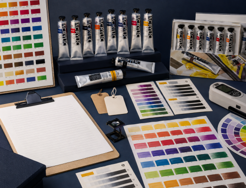
Single-pigment oil colours are useful when a painter wants a direct relationship between one declared colourant and its mixtures. Multi-pigment colours are useful when a ready-made hue, neutral or application colour saves time. Neither category is automatically better. The right choice depends on mixing goals, palette size, repeatability, price and the job assigned to the colour.
The practical difference
| Question | Single-pigment colour | Multi-pigment colour |
|---|---|---|
| Declared colourants | One pigment code | Two or more pigment codes |
| Mixing path | Often easier to analyse | Each component can influence the mixture |
| High-chroma mixing | Can make it easier to avoid unnecessary neutralisation | Can still mix cleanly when the formula and pairing are appropriate |
| Convenience | Painter builds the target mixture | Useful colour is ready from the tube |
| Repeatability | Depends on the paint and batch | Factory-made convenience mixture can be more repeatable than remixing by eye |
| Palette efficiency | Good for a systematic mixing palette | Good for frequently used subject colours or neutrals |
| Quality conclusion | No automatic grade | No automatic grade |
The number of pigments is a formulation fact, not a universal quality score.
Why do artists often seek single-pigment colours?
Single-pigment colours make cause and effect easier to study. When a mixture changes, the artist is working with fewer colourants and can more easily learn:
- the pigment’s warm or cool bias;
- its tinting strength;
- its tendency to create clean secondaries or neutrals;
- its transparency or opacity;
- its behaviour in thin and full-strength applications; and
- how it interacts with a familiar palette.
This can be especially valuable in teaching, limited palettes and colour matching. It does not mean every single-pigment colour is vivid, transparent or easy to mix. Individual pigments have different properties.
Why are multi-pigment colours valuable?
A multi-pigment colour can solve a practical problem before the tube is opened. Common roles include:
- a repeatable neutral;
- a landscape green;
- a portrait or earth mixture;
- a historical-colour approximation;
- a high-value tint;
- a dark that controls chroma; or
- a
huethat substitutes for another pigment.
A professional painter may prefer to mix a green from yellow and blue in one passage, then use a stable convenience green in another. The decision is about workflow, not ideology.
Do multi-pigment colours always make muddy mixtures?
No. “More pigments equals mud” is too simple. Dullness or neutralisation depends on the optical and mixing relationship of all colourants involved, their proportions, opacity, tinting strength and the target colour.
However, a multi-pigment tube introduces more variables. If a convenience green already contains yellow and blue pigments, adding a red may interact with both. That can make the result less intuitive than using one known green pigment.
The answer is to test the actual paint:
- Record its pigment codes.
- Make a masstone and thin drawdown.
- Create a consistent white tint.
- Mix it with the palette’s main warm and cool colours.
- Compare the result with a hand-mixed alternative.
- Decide whether the saved time outweighs any loss of control.
Palette design: assign roles before counting pigments
A coherent palette normally needs functions, not a quota of single-pigment tubes.
| Palette role | What to evaluate |
|---|---|
| Mixing primary or near-primary | Bias, chroma, transparency and interactions with the other core colours |
| White | Opacity, tinting strength, handling and drying behaviour |
| Earth colour | Neutralisation, underpainting and value structure |
| Dark | Whether it creates flexible chromatic darks or a direct neutral |
| Convenience colour | Time saved, uniqueness and frequency of use |
| Accent | Chroma or effect that is difficult to mix from the core palette |
A six-colour mixing set may favour simple formulations. A landscape extension may justify multi-pigment greens. A portrait range may combine single pigments with convenience earths. The set’s purpose should decide.
How buyers should compare ranges
For product teams, the useful comparison is not “What percentage is single pigment?” in isolation. Review:
- whether pigment codes are disclosed consistently;
- whether mixtures have clear reasons to exist;
- whether hue names are accurate;
- whether adjacent colours are genuinely distinct;
- whether core colours mix predictably as a group;
- whether convenience colours solve common tasks;
- whether open-stock replacement is available;
- and whether labels, colour charts and samples match.
Read Colour Names vs Pigment Codes for the label-reading foundation.
A controlled palette test
Use equal, documented proportions rather than visual guesses. For every candidate colour:
- prepare a full-strength swatch;
- spread a thin undertone;
- mix one consistent tint ratio with the same white;
- make two-colour mixtures with the proposed palette partners;
- photograph wet and dry samples under controlled lighting;
- record surface, application tool, batch and date.
The test does not need to declare a winner. It needs to reveal each colour’s job, overlap and missing relationships.
Gamblin’s current Artist’s Oil Color information notes that individual colours have distinct texture, undertone and tinting strength. That is a useful reminder that pigment count is only one part of paint behaviour. See the official Gamblin Artist’s Oil Colors.
The takeaway
Use single-pigment colours when clarity, analysis and flexible mixing matter. Use multi-pigment colours when a well-designed ready-made colour improves speed, consistency or application coverage. A strong oil-colour range makes both roles legible through accurate labels and practical samples.
Explore Phoenix Oil Color and request the current colour information through the Phoenix download centre.
FAQ
Are professional oil paints always single pigment?
No. Professional ranges can include both single-pigment colours and carefully formulated mixtures.
Do single-pigment colours always mix brighter secondaries?
No. The pigment’s hue bias, chroma, opacity and partner colour determine the result.
What is a convenience colour?
It is a ready-made mixture intended to save time or provide a repeatable useful colour, such as a neutral or landscape green.
Should a beginner avoid multi-pigment colours?
Not necessarily. Beginners can learn from simple core colours while using a few clearly labelled convenience colours.
Related Posts