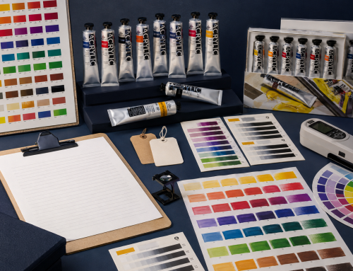
A useful watercolor paint set is not defined by colour count alone. It needs a workable mixing structure, a format appropriate to the user, clear colour information and a realistic path for teaching or replenishment.
Three colours can demonstrate primary mixing. Six can add warm and cool options. Larger sets can reduce mixing steps or support more subjects, but they also increase cost and may introduce redundant colours. The best set is the smallest selection that completes the intended task without creating avoidable gaps.
Begin with a colour-role map
Before choosing names, define what the palette must do. A compact general-purpose set may need:
- a cool and/or warm yellow;
- a warm and/or cool red;
- a warm and/or cool blue;
- an earth yellow or brown for muted mixtures;
- a deep neutral or dark-mixing option;
- optional greens, violets or convenience colours for the target subject.
A three-colour palette is portable and highly educational, but each primary choice strongly affects the available oranges, greens and violets. A split-primary six-colour system expands the mixing gamut by providing warm and cool versions of yellow, red and blue. Winsor & Newton, for example, publishes both three- and six-colour mixing systems for its watercolour ranges; the principle is useful even though every brand’s exact pigments and names differ.
Match set size to the learning or buying task
| Set type | Best use | Strength | Risk to manage |
|---|---|---|---|
| 3–6 colours | Mixing study, travel, focused teaching | Clear relationships and low duplication | Limited convenience colours; pigment choice is critical |
| 10–12 colours | Beginner retail, school and general sketching | Familiar format with broad basic coverage | Can include near-duplicates without a clear role |
| 18–24 colours | Broader retail, hobby and subject sets | More ready-to-use options | Higher price and weaker mixing discipline |
| 36+ colours | Enthusiast or broad-range presentation | Large visual choice and less mixing for common hues | Shelf complexity, underused colours and harder replenishment |
Do not label the smallest set “student” and the largest “professional” without explaining actual materials and use. Colour selection, pigment information, paint strength, handling and manufacturing consistency matter more than count alone.
Choose pigments, not just familiar names
The Colour Index code helps identify the pigment or pigment mixture behind a colour name. This matters because two paints called “Sap Green” or “Cadmium Red Hue” may use different combinations and behave differently.
For each proposed colour, record:
- pigment code or codes where declared;
- transparency or opacity;
- lightfastness rating and its basis;
- staining and granulation where relevant;
- hue bias and mixing role;
- whether it is single-pigment or multi-pigment;
- availability as a replacement pan or tube, if applicable.
A set does not need to be entirely single-pigment. Convenience mixtures can be valuable. The important point is to understand what they add and avoid combinations that make the palette unnecessarily repetitive.
Design for watercolour behaviour
Watercolour users often care about transparency, staining, lifting, granulation and rewetting. These properties should be evaluated through dried paint, not inferred from a screen swatch.
A simple comparison card can include:
- masstone or concentrated wash;
- graded wash from dark to light;
- wet-in-wet spread;
- lift test after a defined drying period;
- mixture with the neighbouring primaries;
- label with pigment and sample reference.
Use the same paper, brush, water ratio and drying interval for every comparison. This makes the card a useful approval record rather than a decorative colour chart.
Retail and education sets need different support
For retail
The buyer needs a clear reason for each format and price point. Packaging should show the actual colours, pan or tube size, mixing purpose and whether replacements are available. A QR code or short URL can lead to a first-painting exercise, but it should not replace essential product information.
For schools and workshops
Consistency is especially important. Teachers need stable set contents, names that match lesson plans, predictable replacement options and colours that can complete the curriculum’s exercises.
Ask:
- Can the set produce a colour wheel and useful neutrals?
- Does it support the intended landscape, botanical or portrait tasks?
- Are highly staining colours explained?
- Can frequently used colours be replenished efficiently?
- Do printed, online and physical colour references agree?
Plan tubes, pans and packaging together
Pans are compact and convenient for portable palettes. Tubes make it easier to prepare larger washes and refill wells. A mixed programme can serve both, but it increases SKU and document control.
Specify the set tray, closure, mixing areas, brush or accessory role, colour order, labels, barcode and outer carton at the same time as the palette. Make sure pigment and colour information remains readable at the final package size.
Phoenix presents tube, pan and set formats within its watercolor painting supplies category. Use the page to review the range structure, then confirm current colours, sizes, packaging and availability for the intended market.
Build a staged approval process
- Define audience, target price and learning or retail task.
- Approve colour roles before approving names.
- Review pigment and performance data.
- Test physical samples on one controlled paper.
- Complete at least one realistic painting or lesson exercise.
- Approve set contents and packaging artwork together.
- Confirm production samples against the retained reference.
- Review replenishment and change-control rules.
This sequence prevents the box design from defining the product before the colour system has been validated.
Frequently asked questions
How many colours should a beginner watercolour set have?
There is no universal number. A well-chosen 6- or 12-colour palette can teach more than a larger but redundant set. Match the count to the intended exercises and price point.
Are more single-pigment colours always better?
They can make mixing behaviour easier to understand, but useful convenience mixtures also have a role. Evaluate each colour’s function and disclose its pigment composition.
Should a school set include white?
Traditional transparent watercolour often uses the paper as the lightest value, while opaque white may be useful for specific classroom or mixed-media tasks. The answer depends on the curriculum and product promise.
What should be approved besides the colour list?
Approve physical paint samples, pigment and performance information, format, packaging, labels, replenishment and a production-reference sample.
Next step
Explore Phoenix watercolor painting supplies and contact Phoenix Art Materials for current range information and sample discussion.
Editorial sources
Related Posts