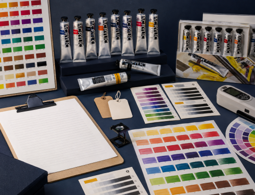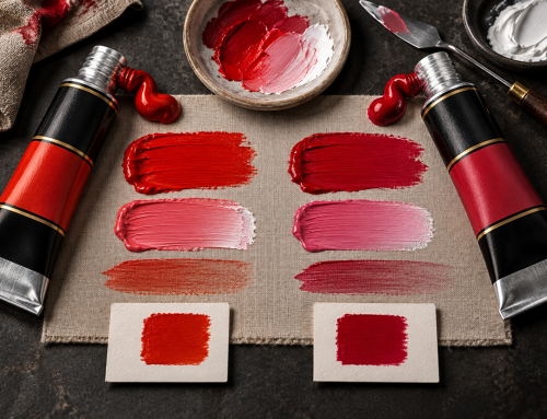
Opacity, undertone and tinting strength describe different paint behaviours. A colour can be transparent yet powerful in a white mixture, opaque yet relatively gentle, or nearly black in masstone while revealing a vivid undertone when spread thin. That is why a screen swatch—or one thick dab—cannot explain how oil colours will work.
The direct comparison
| Behaviour | The question it answers | Simple observation method |
|---|---|---|
| Opacity/transparency | How much does the paint film hide what is beneath it? | Apply a controlled film over black-and-white contrast |
| Undertone | What hue and bias appear when the paint is spread thin? | Draw the paint from masstone into a thin film |
| Tinting strength | How strongly does the colour influence another colour? | Mix a documented ratio into the same white |
These tests should use the same surface, tools, ratios, lighting and documentation if results are being compared.
Masstone and undertone are not the same
Masstone is the appearance of paint applied in a sufficiently concentrated layer. Undertone is the appearance revealed in a thin film or extension.
A dark blue may look nearly black in masstone but reveal a distinctly red or green bias in undertone. An earth colour may look dense in a thick passage and warmer when spread. These differences affect:
- colour mixing;
- glazing;
- shadow passages;
- neutralisation;
- underpainting; and
- selection between apparently similar tubes.
To document the relationship, place a full-strength swatch next to a smooth drawdown made with the same sample. Record the surface and film method.
Opacity is relative to application
Transparency and opacity are material behaviours, but the visible result also depends on film thickness, pigment concentration, surface, lighting and application.
Winsor & Newton’s terminology guide notes that transparency is relative: a thin paint film appears more transparent than a thicker one. A label symbol should therefore be treated as a useful category under a declared system, not as a guarantee that every brushstroke will cover identically. See Terms Explained.
For a practical opacity drawdown:
- Use a card with stable black and white areas.
- Apply a controlled wet-film thickness.
- Keep tool pressure and direction consistent.
- Photograph under fixed, colour-managed lighting.
- Evaluate again after the film reaches the defined dry state.
Do not compare one paint applied thickly with another scraped thin.
Tinting strength is not the same as pigment load
Tinting strength describes how strongly a paint changes a mixture. It is often observed by adding the colour to white at a fixed ratio. Pigment load refers to the amount or concentration of pigment in the formula and cannot be calculated reliably from a visual tint alone.
Tinting strength is affected by pigment type, particle properties, dispersion, opacity and the chosen white. A strong tint is not universally desirable: it can be efficient for large mixtures but harder to control in delicate passages.
Use a tint ladder rather than one arbitrary mixture:
- record all quantities by mass;
- use the same white and batch;
- keep total mixing time consistent;
- include at least three documented ratios;
- label wet and dry observations;
- avoid ranking unmatched pigments as though they were formula equivalents.
Why these three behaviours matter to palette design
A balanced palette does not need every colour to behave alike.
- Transparent colours can support depth and glazing.
- Opaque colours can establish coverage and direct highlights.
- High-tinting colours can efficiently shift mixtures.
- Lower-tinting colours can allow subtle control.
- Different undertones provide warm/cool routes inside one hue family.
The goal is a legible range in which adjacent colours have useful differences and the chart helps the artist predict them.
A minimum technical image set for each colour
For a serious colour chart or buyer evaluation, capture:
- Masstone.
- Undertone drawdown.
- Opacity over black and white.
- A defined white tint.
- Wet and dry state, where change is relevant.
- Pigment code, opacity category and rating legend.
- Surface, tool, ratio, batch and capture date.
Electronic colour chips can remain as navigation aids, but they should not be presented as substitutes for these observations.
How the commissioned artist video fits
Phoenix’s commissioned artist comparison with Winsor & Newton Winton contains useful studio observations about consistency, body, selected opacity, thin application and tinting strength. It is not a controlled laboratory comparison and should not be used to assign product-wide ratings.
See the C-site article, Phoenix Artist Oils vs Winsor & Newton Winton: An Artist’s Five-Painting Comparison, then use the test framework above to understand what additional controlled evidence would be needed. The full video is available on YouTube.
The takeaway
Opacity tells you how the film covers, undertone reveals the hue in a thin layer, and tinting strength shows how powerfully a colour changes a mixture. Evaluate all three separately, with a documented method.
Explore Phoenix oil colours. For a product evaluation, contact Phoenix and request the current series-specific documentation and samples.
FAQ
Can a transparent colour have high tinting strength?
Yes. Transparency and tinting strength describe different behaviours.
Is masstone the colour straight from the tube?
It is the concentrated appearance of the applied paint, not merely the bead as it exits the tube. Film thickness and surface still matter.
Can I compare opacity from website swatches?
Not reliably. Use controlled black-and-white drawdowns and documented film thickness.
Does strong tinting prove high pigment concentration?
No. It is an observable mixing result influenced by several formulation and pigment variables.
Related Posts